
My Role: UX/UI Designer
Programs used: Figma, Photoshop, Kap
Project Duration: 25/02/23 - 03/02/23
Project brief
Redesign the main product page on the mobile app of the global women's clothing brand PLT.

The Problem
I have noticed that friends and family members who shop at PLT often complain about the product page on the PLT app, in particular the size selection, quantity selection (or lack there of), and wishlist elements. It turns out, this is a larger problem that expands beyond my social circle, as there are many reviews online that also complain of the product page issues.
The Goal
The main objective was to see how big of problem this is, and explore whether an improved information architecture and UI elements can solve the issues that people may be having with the current product page experience on the PLT app.
My Responsibilities
Quantitative research, UX design, prototyping, visual design, testing and iteration.
Process
My process is adapting and evolving with every project. It will be determined by the goals of the project, the problem/problems that need to be solved, time and resources.
The process I used to solve this problem was as follows:


Competitive Analysis
In order to understand key objectives, marketing profile, strategy and usability of similar products, I went searching for some to find what is working well and not so well. I chose ASOS and BooHoo as these brands are leaders in this field, and ASOS in particular is well known for having a great user experience on their site.


Main objectives for the research was to:
- Understand the typical user of the PLT app.
- Gain an insight into how the product page makes the user feel and the experiences they have had.
- Gain an insight as to whether the page is meeting the user’s needs.
Online Reviews & Interviews
The first step was to check the user reviews of the PLT app.
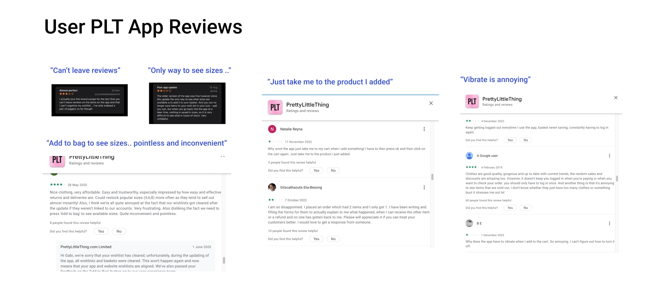
The reviews confirmed my interviewees experiences of the product page section of the app. I found nearly 40 negative reviews on the issue of "adding to bag" on the product page among some other problems - (see some key reviews above).
Personas

🚩 Key Issue 1
The most frequent complaint that I found about the “add to cart” process seemed to be the sizing feature, which is only able to be viewed upon clicking “add to bag”. The frustration comes from a lack of match between system and the real world (natural mapping), whereby you would never add an item to your shopping basket and then check the size after.
Another issue on this subject that surfaced during the interviews was the fact that users had to scroll down in order to find there size, and that there was no way to tell if the item was even in stock. My interview data and external research showed that this causes 2 issues. One, if the users size isn't in stock, it takes even more time for them to discover this and causes further frustration/wasted time. The second is that it can affect certain people psychologically who are maybe insecure about scrolling down to the larger sizes.
✔️ Solution
Create a user flow where the user chooses the colour and size of the product that they select before adding to basket. Also means - less instruction text for a more minimalist design and less clicks. For the scrolling issue, adding a feature that allows users to select/see sizes with minimal effort should solve the problem.
🚩 Key Issue 2
A few users also expressed a lack of freedom with the pop up modal that appears when adding to cart. It acts as a notifier to let the customer know that the item has been successfully added. One review expressed irritation with not being immediately brought to the cart (or at least having the option). This was revealed in an interview I conducted and also found in 12 user reviews.
Note - another key issue with the product page which kept showing up in the reviews of the app, was the lack of ability to leave/read reviews on products as there is no frame of reference for each product.
✔️ Solution
Create an option in the pop up modal whereby users can choose to return to shopping or go straight to the cart checkout page. As well as adding a review feature to the page without making it to "cluttered".

New Flow

1st Iteration & Prototype - Mid Fidelity
Comparison to original


Testing Results
After some user testing of the mid fidelity designs, it was clear that the natural mapping issue had been solved (selecting size before adding to cart). However, the issue of users having to scroll to find their clothing size was still an issue. In order to solve this, I designed a 2nd higher fidelity iteration with the use of size selection buttons instead of a drop-down menu, and re-arranged the hierarchy with a more polished UI. Some external research also revealed that in some studies, 72% and higher of users preferred buttons for size selection over drop down menus.

2nd Iteration & Prototype

Issues Solved Recap:
Buttons Over Drop down Menu
- The current drop down menu often results in error messages according to my research due to a lack of natural mapping. This issue was fixed with a buttons feature, as buttons require less taps/clicks from the user (quicker desired outcome). Also users can now immediately see size options without having to take action.
- From a psychology perspective, evidence from my research also shows that users having to scroll down to find their size can result in feelings of insecurity about their weight. This issue is also fixed with the button alternative.
Options After Adding To Cart
- The original design brings the user to a modal after adding a product to their cart, with no option to bring them straight to checkout - this is a common complaint that I found in the reviews of the app. The new design gives the user a choice to either keep shopping, or go straight to their cart.
Product Availability & Quantity
- The new design includes the quantity of product the user would like to add to their cart, and up to date information on whether a product is in stock. These were among the most common user frustrations.
Wish List Made More Clear
- Wish list symbol has been redesigned as a larger button and text to avoid confusion as to what the "heart" feature actually does.
Review Feature Added
- Review feature added so that users can leave & read reviews - Another feature that users requested in the research phase and a feature that other successful competitors use with great success.
Rounded Edges For Buttons
- There have been many studies that can be found online that prove humans tend to favor rounded edges over sharp angles or pointed edges due to a subconscious fear in brain processing. This theory is called "contour bias" and is the reason why I changed the buttons to rounded edges.
