
My Role: UX/UI Designer
Programs used: Figma, Miro, Photoshop, Kap
Project Duration: 10/05/23 - 01/06/23
Project brief
Teddy Nursery is a new upmarket nursery brand designed for parents in and around Greater Manchester. The primary audience will be prospective parents using the site to find out more information about the services they offer, plus other information like prices whilst making a decision which nursery to send their child to.
Existing parents may use the site to get in touch with the nursery and see updates e.g. those relating to holiday closures, etc.
Analytics from their original site showed that whilst the majority (62%) of visitors are on mobile, 48% percentage of desktop users. Desktop users were likely to be parents browsing nursery websites while in the office.
The main focus was to completely redesign the main homepage and the individual nursery pages in order to give the users a much better experience.

The Problem
The nursery business has been declining the UK in recent times due to many parents now working from home following Covid-19. As a result many of the nurseries, (particularly upmarket nurseries), have been forced to close down in the last few years.
The quality of digital sites, online presence and reviews, are quickly becoming vital to keeping new/existing nurseries in business, as it is now an expected component in today's world by parents.
The Goal
The main objective was to see what kind of features and UI some of the most successful competitors were implementing in order to narrow down which elements are needed/expected by parents in nursery sites. Also, to discover what some of the users pain points might be in current nursery sites.
The results would influence what this brand might look like, which features it would contain, and how the business may grow its online presence to become a strong competitor in this industry.
My Responsibilities
Quantitative research, UX design, prototyping, animation, visual design, testing, logo design, and iteration.
Process
My process is adapting and evolving with every project. It will be determined by the goals of the project, the problem/problems that need to be solved, time and resources.
The process I used to solve this problem was as follows:
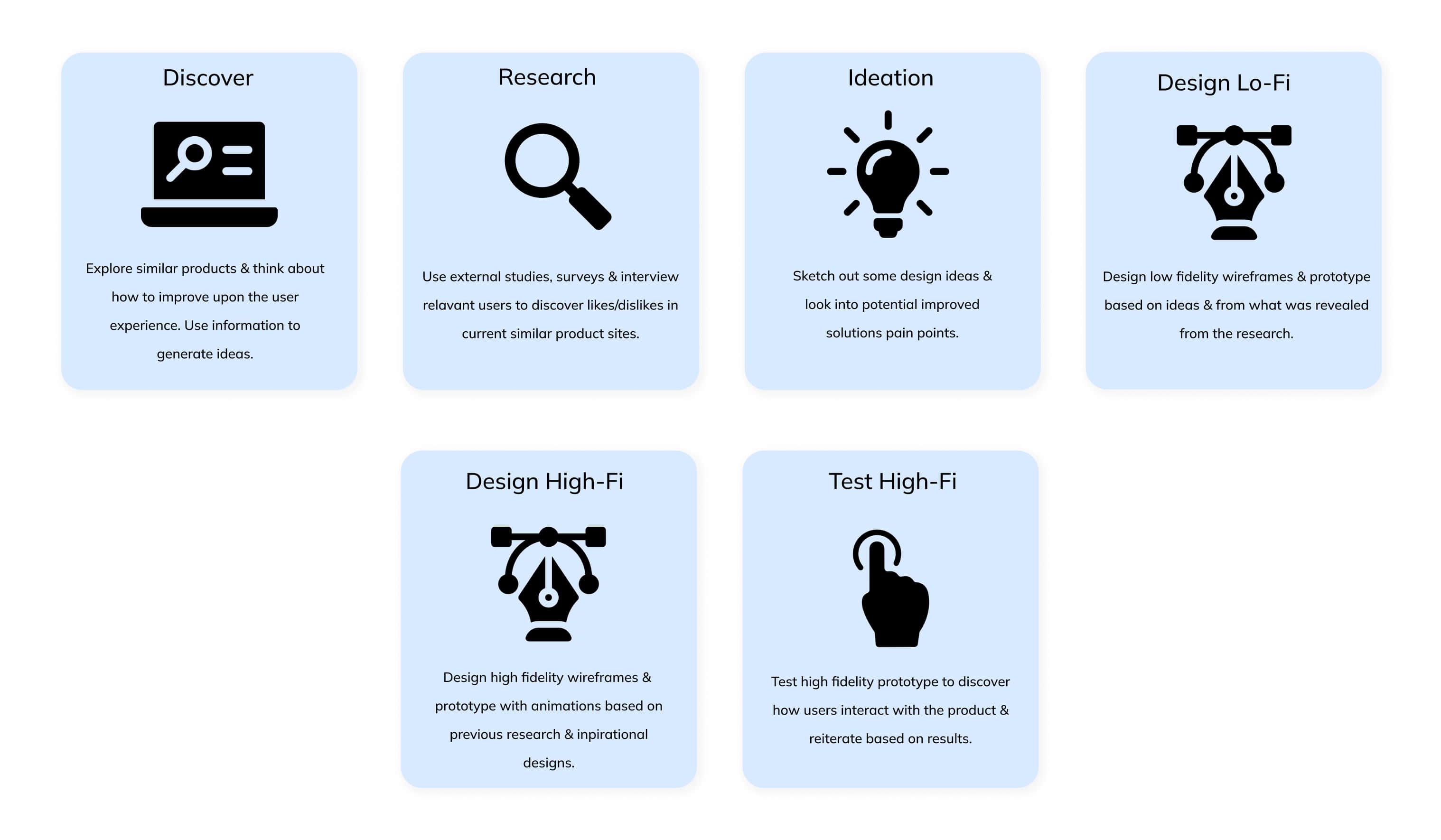

Competitive Analysis
In order to understand key objectives, marketing profile, strategy and usability of similar products, I went searching for some.
The nursery sites that I found (see below), are some of the most successful current chains in and around the UK in the upmarket sector. I analysed the different features, reviews and specs of each, and came up with a list of pros and cons.


Research Goal
I was interested in exploring opportunities in upmarket nursery chain websites. I interviewed 4 parents who had either used nursery sites before and/or are currently using them. The purpose was to find out what these sites are doing well, pain points, and what (if anything) may be missing. The results would contribute to some of the final products key features.
User Personas


Themes & Opportunities
In order to narrow down some feature ideas for the site, I created an affinity board from the interviews. Most of the upmarket nurseries do have some great features, although some of the interviews I conducted suggested that there are some elements that could use improving as can be seen above.
After going through all the data, I produced 12 top features for potential solutions and prioritised them according to risk & value.

Site map
Before designing the low fidelity wireframes, I first re-worked the user flow & polished the products features.
Below is a site map, which details some of the key user flows throughout the site, as well as some of the potential features.


I designed lo-fi wireframe screens for the main homepage and for one of the individual nursery pages in order to get an idea of the layout. I would later go on to create a site map in order to detail some of the more complex flows, but this was just to get things started with some of the potential features. Elements were placed according to their value based on the interviews and surveys, for example: 80% parents cared more about the reviews of a specific nursery than the reviews of all the collective nurseries as a whole. The reviews were therefore placed higher up on the individual nursery pages so that parents would see them faster when scrolling (see below).


Laying Down The Foundation
It was important that this website had fun, playful characteristics, whilst staying upmarket and professional. One of the main complaints for many of the upmarket nursery sites was that they looked to "serious" and "adult". Although nursery sites are aimed at parents, it's still important to give a perception of playfulness, as it's the parents children that will be attending. One of the main selling points is that the child will want to return.
The layout and UI design I implemented was influenced by websites designed for children's events, as well as wellness sites. I tried to find products with soft, lighter colours, as well as shapes and sans serif fonts with rounded edges to subconsciously signify safety (contour bias). Many external studies perceived soft blues, yellows and greens as the most "calming" colours. These naturally became the main colour themes for the final UI, and were tested through "Webaim" against darker typography in order to meet the WCAG AAA standards. This helps to accompany users with colour blindness or imperfect vision.

Style Guide
This is a style guide for Teddy Nursery. This style guide contains colors, typography, buttons, and icons:


After designing the first high fidelity prototype on mobile and desktop, I performed a few usability tests on the same people I interviewed in the research/discovery phase. The purpose was to test how the draft designs performed.
🚩Key Findings:
1. Site was perceived as slightly to "playful/childish" and as a result, no longer upmarket
2. Prices for individual nurseries not clear enough on page
3. News feature was perceived negatively by all users on the main homepage: "unnecessary clutter"
4. Mobile prototype - nursery scroll automation to fast and skips nurseries
5. No food menus and/or health & safety procedures on specific nursery pages
✔️ Solutions
1. Sites required some animations/micro-interactions and colour changes in order to keep the "upmarket" persona
2. In edition to a secondary button on the footer, I added another button to allow users the ability to download a prices brochure
3. News/blog feature added to nav bar rather than cards on the main page in order to free up space and reduce the features hierarchy
4. Automation slowed down on mob prototype and reduced to one nursery card at a time
5. Food menu and H&S cards added to individual nursery pages with buttons to view details
Responsive design
The designs translated very well to mobile from desktop. This is particularly important as research showed that users of nursery sites tend to browse on both desktop and mobile.

Animations & Micro-interactions
The next step was to add some micro interactions and animations. Micro interactions can establish confidence in the business due to the subtle attention to detail, and make websites feel more premium. Here's an example (see below):
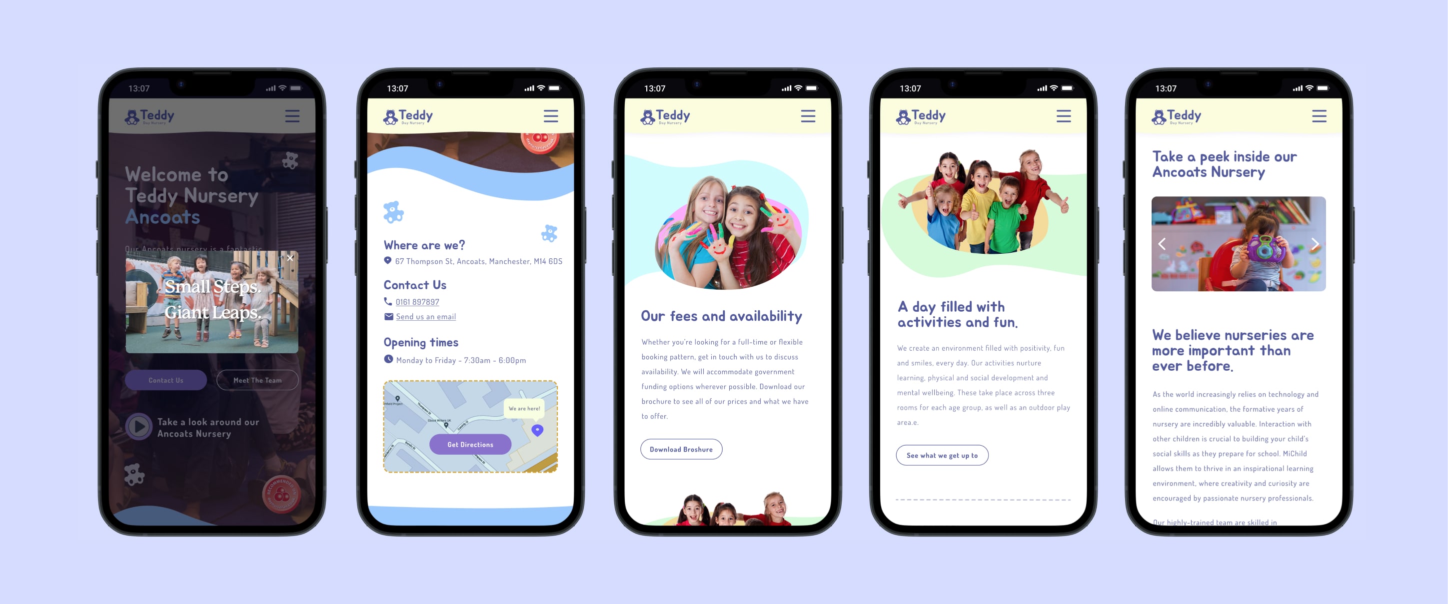
Mobile


Desktop Screens

Mobile Screens


What I have learned from this project?
I very much enjoyed the process of designing this site and thanks to the help of the user interviews and test participants, I felt that this design was an overall success.
Every project is a learning curve and with this one, I learnt the importance of empathising and understanding the wants/needs of a very specific archetype of user. This allowed me to think outside the box and be more imaginative and creative with my solutions.
Regarding improvements, It would be nice to analyse this website further from different user perspectives (eg location, economic class, age), to gain an even deeper understanding of the users needs from a larger scope of parents. However, on this particular project, there was limited research, time and resources for more in depth user testing.